SDS (Shareholder Data Service)
In SDS (shareholder data service) helps brokers and clients in sorting Mass amount of shareholder data from votes to where its coming from and how much did they vote on. " This application has been used for at most a decade and hasn't been updated to modern designs and not aligned to our current design system.
Recent Client
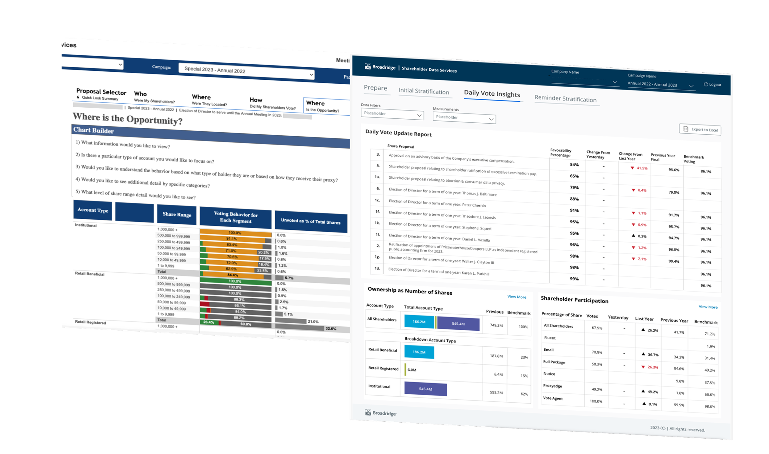
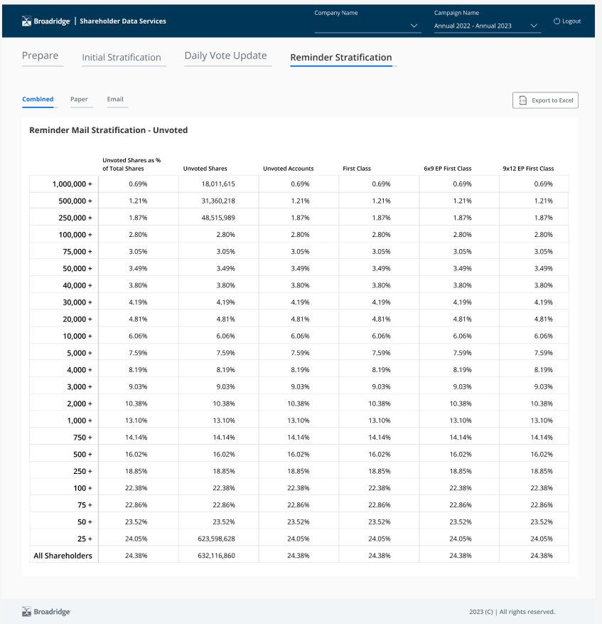
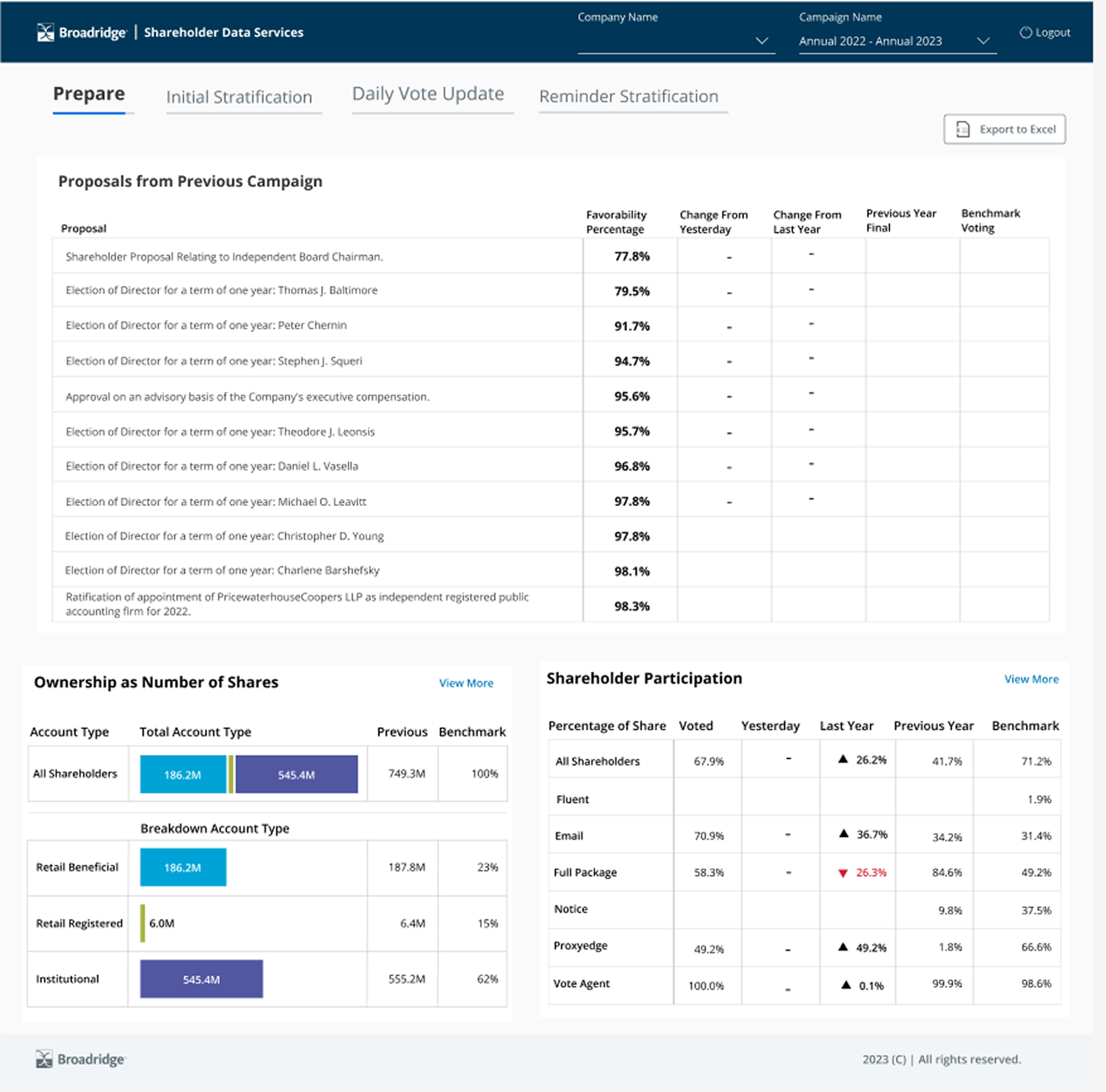
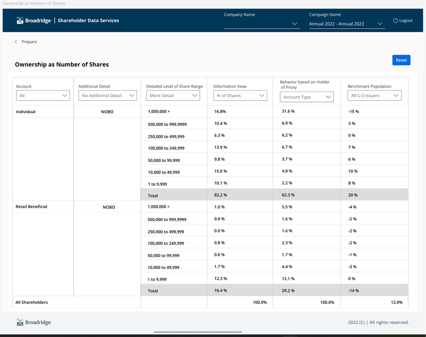
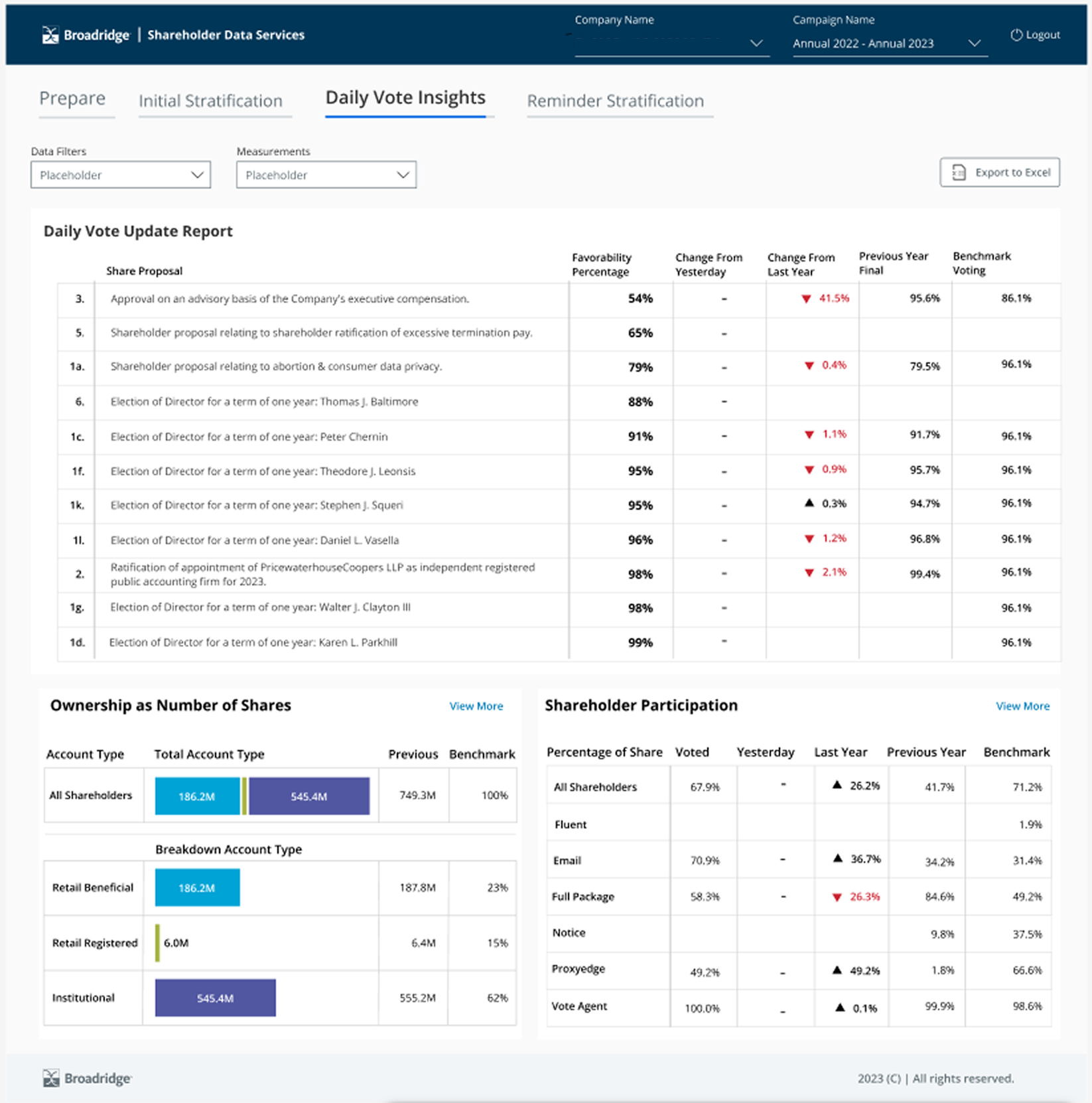
This was going to be our biggest challenge. The complex, high volume of data on the page felt clunky and overwhelming to users and to our team alike. One of my largest hurdles was fully comprehending that dense information and distilling it into a cleaner, more streamlined and usable format. I organized several focused ideation meetings to collaborate closely with stakeholders, surface their priorities, and build a clearer, shared understanding of the core pain points we needed to address.
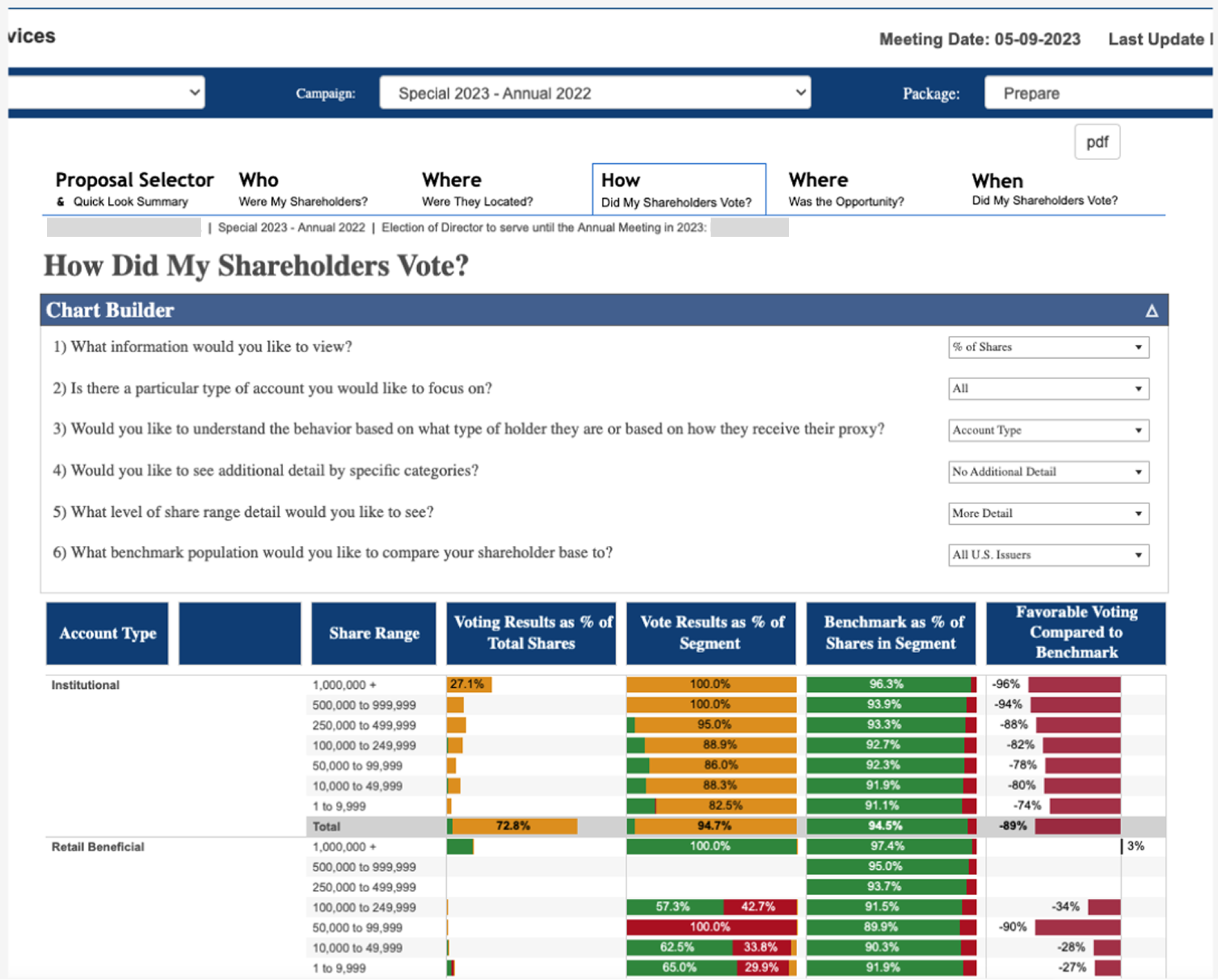
“I’ve never seen so many ways to see data it’s very overwhelming”
--SDS User
Understanding the data
Advancing Possibilities Through Other Teams
Smart Warehouse Retrofit
A discovery from those meetings was accessibility and how to go about that. Users felt that the bar graphs and were too close together and hard to read. Also it pushed off users from wanting to use the application because of that.
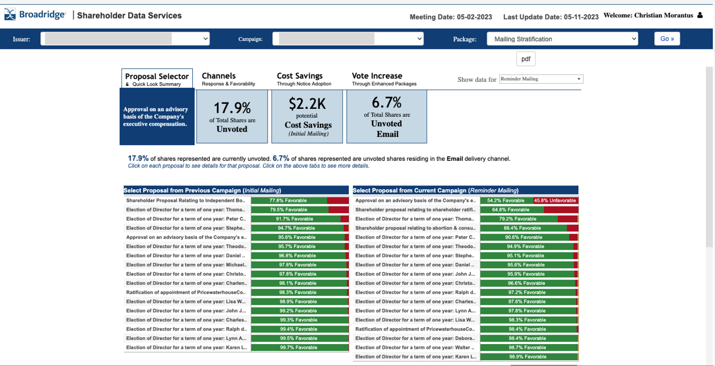
The navigation system was hard to well navigate and the most asked question / pain point was when this was going to be updated. Users felt judging by the dated looks it felt unsecured and unsafe to look through data.
Municipal Water Monitoring
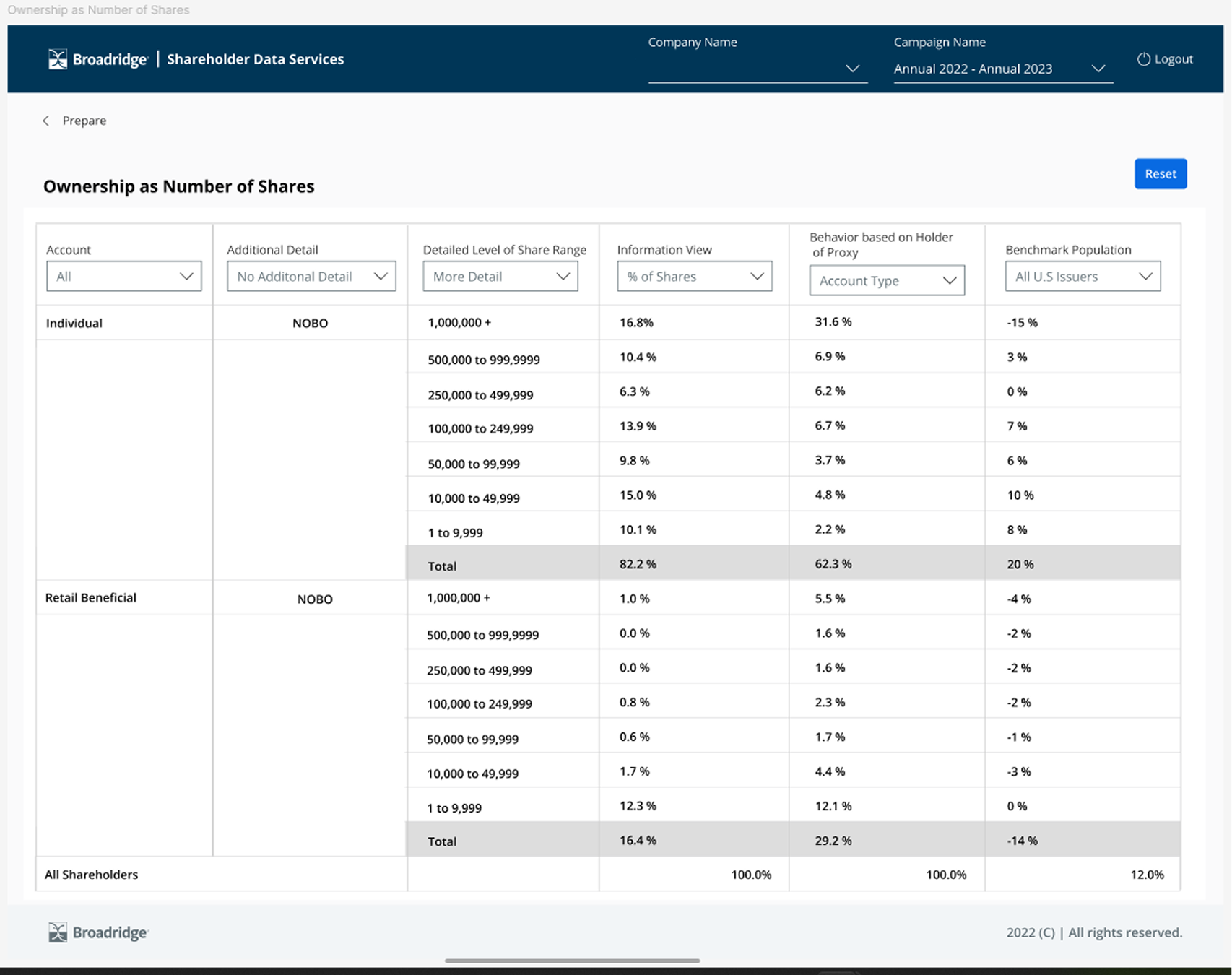
From the initial talks I began working on system architecture and how users would navigate it. From that foundation I started the first round of page designs for the application, outlining layout, hierarchy, and key interactions. The early work took some time; one of the biggest hurdles was coordinating with developers to determine how feasible the update would be and whether the framework we’re using could support the proposed changes. As I neared completion there were a few additional bumps in the road, particularly around how to present the many different graphs and charts. Through targeted research and close collaboration with other designers, I arrived at a cleaner, more consistent solution for the data visualizations.
The long stretch
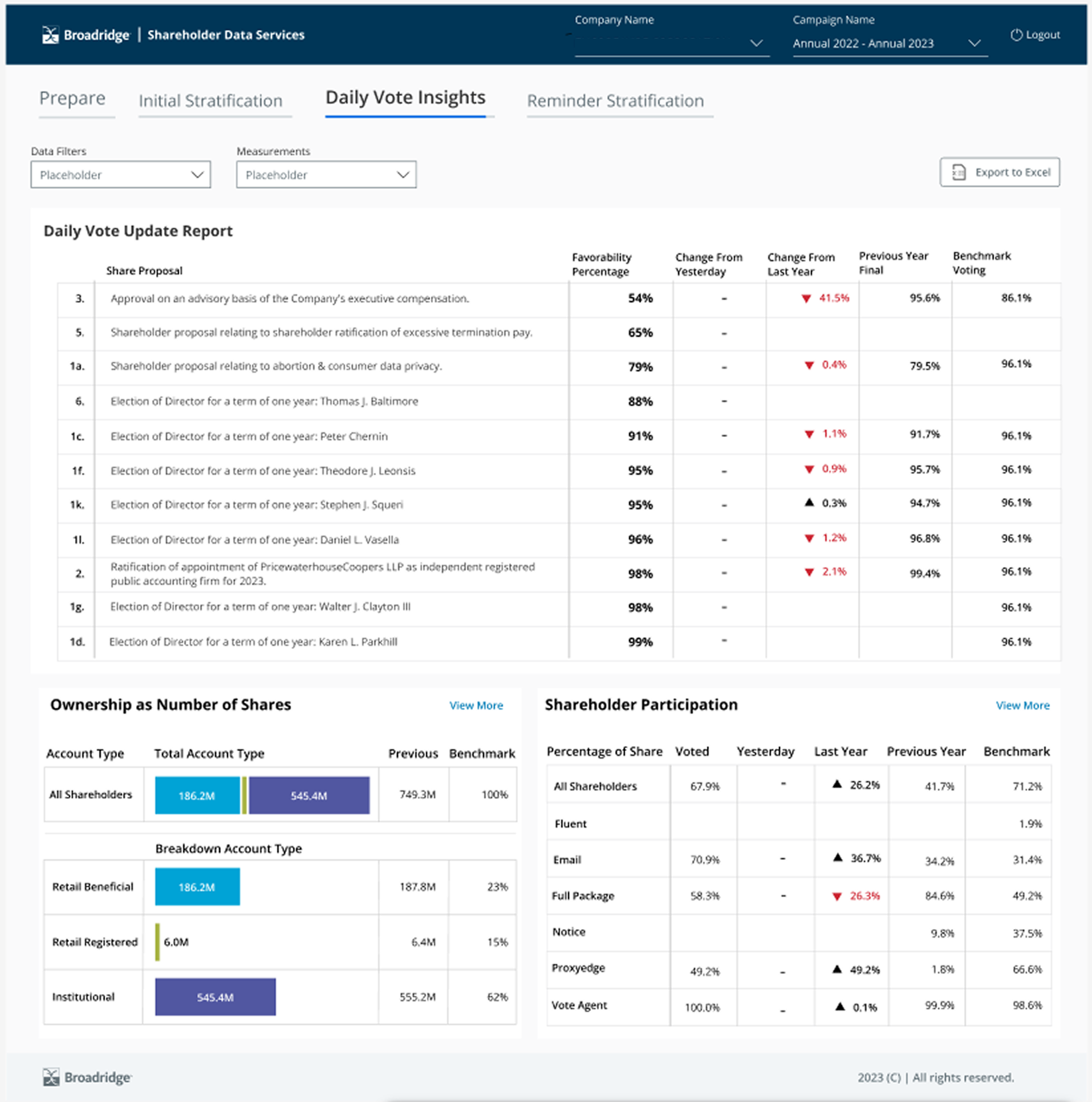
As I neared completion, a few more bumps appeared along the way, mostly caused by the many different graphs that needed to be presented and aligned with the overall design. Through initial research and close collaboration with other designers, I was able to develop a much cleaner, more consistent approach to the data visualizations. After working through a range of difficulties and challenges—from accessibility issues to coordination with developers and iterative feedback—the project ultimately came together successfully.
Advancing Possibilities Through Proven Projects
The revamped application improved user experience in several measurable and qualitative ways, driving the reported 20–30% increase in traffic and broader platform engagement:
Clearer information architecture
Navigation was simplified and restructured around primary user tasks, reducing cognitive load and time-to-task completion.
Key workflows were surfaced more prominently, so users found relevant features without deep searching, which increased feature discovery and session duration.
More intuitive interaction design
Updated UI components (consistent controls, clear affordances, and contextual guidance) lowered friction for new and returning users.
Microcopy and progressive disclosure provided just-in-time information, helping users complete complex tasks with fewer support requests.
Visual clarity and accessible design
A refined visual hierarchy and stricter accessibility practices made content easier to scan and interact with across devices and for users with varying needs.
Better contrast, spacing, and responsive layouts improved usability on mobile and tablet, expanding the practical user base.
Stronger cross-product integration
Consistent patterns and shared components across products reduced learning costs when users moved between applications.
Integrated entry points and cross-promotional cues made it easier for users to discover complementary tools, amplifying overall platform engagement.
Combined, these improvements reduced friction, increased satisfaction, and encouraged exploration—directly contributing to higher traffic and spillover interest